


You’ve scrolled past countless white kitchens, admiring their crispness but sensing they lack the warmth your home needs. Warm neutrals—think soft beige, biscuit, mushroom gray, and sandy tones—offer that missing layer of comfort while maintaining the clean aesthetic you’re after. These shades work beautifully with natural materials like marble, limestone, and honey-toned wood, creating spaces that feel both timeless and lived-in. Here’s how designers are using these versatile colors to craft kitchens that welcome you home.
🏡 Shop the Look: Warm Neutral Kitchen Essentials
Disclosure: This post contains affiliate links. If you purchase through these links, I may earn a small commission at no extra cost to you. Thank you for supporting NewTrendSetter!
NewTrendSetter is a participant in the Amazon Services LLC Associates Program, an affiliate advertising program designed to provide a means for sites to earn advertising fees by advertising and linking to Amazon.com.
Shop This Look

[NON-SHEDDING]: Expertly machine-woven from enhanced soft synthetic durable fibers that have a virtually non-shedding pile for ultimate convenience
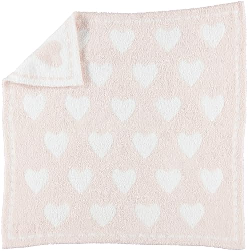
COZY AND COMFY: Give your kid a goodnight sleep with this Dream Receiving Blanket. Perfect for a comfortable sleep on cold nights.
Soft Beige Kitchen Cabinets With Marble Countertops

When you choose soft beige cabinets paired with marble countertops, you’re selecting a combination that’s stood the test of time in high-end kitchen design. The soft beige undertones in your cabinetry create a warm foundation that won’t feel sterile or cold, especially when you’re spending hours cooking family meals or entertaining friends on weekends.
Marble veining patterns add natural movement and visual interest, transforming ordinary surfaces into statement pieces that catch the eye without overwhelming your space. Popular choices include Calacatta marble with its bold gray veins or Carrara marble featuring softer, more subtle patterns.
This pairing works particularly well in blended-style kitchens, where you’re merging traditional warmth with contemporary clean lines, creating a timeless aesthetic that’ll remain stylish for decades. You can extend this sophisticated marble aesthetic beyond your countertops by incorporating marble coffee tables into adjacent living spaces for a cohesive design flow throughout your home.
One thing that tends to get overlooked in warm neutral kitchens is the countertop clutter. Utensils, plates, napkins — they add up fast. This acrylic and wood silverware caddy keeps everything in one spot without feeling out of place. It’s the kind of small detail that pulls a kitchen together.
Shop This Look

Size: We offer three different lengths for you to choose from, which are 78.7inch,197inch,393inch, the area region that can be covered is roughly 9.46 square feet, 23.62square feet, 47.2square feet. If you want to sticking a large area, we suggest you choose the 393inch

Always Keep your coffee bar Clean and Tidy. Utility coffee accessories you absolutely deserve to have.
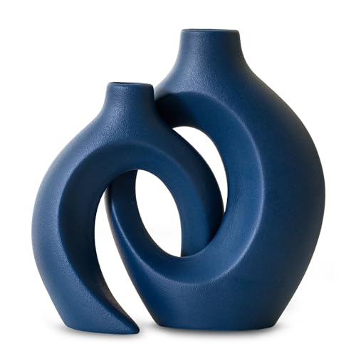
🌷[Dimensions]- This set includes 2 large beautiful matte Matte Navy Blue handmade vases. The taller vase measures W 6.3" X H 8.4" with a neck opening of 1.3". The shorter vase measures W 5.4" X H 7" with a neck opening of 0.9".anthropologie home decor
Creamy Kitchen Cabinets With Warm Brass Hardware

As you explore timeless kitchen finishes, creamy cabinets paired with warm brass hardware create an instantly sophisticated look that’s been dominating design magazines and home renovation shows throughout 2023 and 2024.
This combination works because the creamy undertones complement brass’s golden warmth, creating visual harmony that feels both modern and traditional.
You’ll find that cabinet staining techniques like layered glazing or whitewashing can achieve the perfect creamy shade, making each piece uniquely textured.
Hardware finish pairing requires attention to metal tones, with unlacquered brass aging beautifully over time while satin brass maintains consistency.
Consider brands like Amerock or Schoolhouse Electric for quality brass pulls and knobs that’ll withstand daily use while elevating your kitchen’s aesthetic appeal.
To complete the warm metallic theme, display gold taper candle holders on open shelving or your kitchen island for an elegant finishing touch that echoes the brass hardware.
Shop This Look

MADE IN THE USA - Proudly made right here in the USA at our Wisconsin headquarters and formulated with cutting-edge German ingredients, Flitz delivers unbeatable quality you can trust. Flitz brushed nickel cleaner and wax for sinks are made to last and perform each time

Premium Material - Our gold cabinet knobs are made of high quality stainless steel, hollow but sturdy and look beautiful and serve your purposes

PREMIUM MATERIAL: Plustool Gold Cabinet Handles are made of high-precision quality stainless steel with perfect brushed brass finish, which do not leave any fingerprint; The flat surface of dresser handles is smooth without losing texture, not easy to fade,rust,oxidation and easy to clean; Durable and strong, elegant addition to any home
Sandy Beige Shaker Cabinets for Modern Farmhouse Style

Sandy beige Shaker cabinets have become the cornerstone of modern farmhouse kitchens, offering a softer alternative to stark white while maintaining the clean lines that make Shaker style so enduringly popular.
The simple, recessed-panel shaker detailing works beautifully in sandy tones, creating visual interest without overwhelming your space with ornate decoration.
You’ll find this cabinet finish pairs exceptionally well with natural wood accents, black matte fixtures, and butcher block countertops.
Benjamin Moore’s “Shaker Beige” and Sherwin-Williams’ “Kilim Beige” are designer favorites that photograph beautifully in various lighting conditions.
The warm undertones in sandy beige cabinets create a welcoming atmosphere while hiding minor wear better than their white counterparts.
They’re forgiving with fingerprints, grease splatters, and everyday kitchen use, making them practical for busy households.
Complete the look with designer spice racks that complement the warm neutral palette and enhance your kitchen’s functionality.
Biscuit-Colored Kitchen Cabinets and Brushed Gold Fixtures

Biscuit-colored kitchen cabinets bring a buttery warmth that’s slightly richer than beige, creating an elegant foundation that pairs magnificently with brushed gold hardware and fixtures.
Biscuit cabinets deliver buttery warmth that perfectly complements brushed gold hardware, creating an elegant and sophisticated kitchen foundation.
The subtle cream undertones in biscuit cabinetry add depth without overwhelming your space, making it feel cozy yet sophisticated.
When you install brushed gold faucets, cabinet pulls, and light fixtures, you’ll create a luxurious brushed gold contrast that elevates the entire design.
This combination works particularly well with marble countertops featuring gold veining, white subway tiles, and natural wood accents.
The biscuit undertones catch natural light beautifully throughout the day, shifting from soft yellow in morning sun to warm amber during golden hour, giving your kitchen a dynamic, lived-in appeal that white cabinets simply can’t match.
Complete the look with stylish marble cutting boards that complement your countertops while adding both functionality and decorative appeal to your workspace.
Almond Cabinets With Warm Terracotta Floor Tiles

When you pair almond cabinets with warm terracotta floor tiles, you’re creating a Mediterranean-inspired foundation that brings sun-baked earthiness into your kitchen while maintaining a neutral palette that won’t feel dated in five years.
The almond undertones in your cabinetry pull subtle pink and peach notes from the terracotta, establishing visual harmony that feels intentional rather than matchy-matchy.
Consider traditional terracotta grout patterns like herringbone or Saltillo layouts to add architectural interest underfoot, which creates depth without overwhelming your space.
Designer Sarah Richardson notes that “terracotta grounds warm neutrals beautifully,” giving kitchens an organic, lived-in quality.
This combination works especially well in kitchens with abundant natural light, where the tiles’ natural variation catches sunlight throughout the day, creating dynamic shadows that enhance your room’s warmth.
If you’re looking for a budget-friendly backsplash update to complement these warm tones, marble peel and stick options can add elegant visual texture without the commitment or cost of permanent installation.
Oatmeal Shaker Kitchen With Antique Brass Pulls

While terracotta tiles deliver warmth through texture and pattern, oatmeal Shaker cabinets achieve the same cozy neutrality through streamlined simplicity, and when you add antique brass pulls to this combination, you’re layering in a third dimension that elevates the entire design.
The oatmeal texture reads warmer than stark white, offering enough depth to prevent your kitchen from feeling sterile while maintaining that clean, fresh aesthetic you want.
Antique brass hardware introduces subtle patina and vintage character, creating visual interest against the smooth cabinet faces without overwhelming the space.
This approach works particularly well in farmhouse-style or adaptable kitchens, where shaker simplicity provides the foundation for timeless appeal.
You’ll find that this palette pairs beautifully with natural wood countertops, marble backsplashes, or even concrete surfaces.
Complete the look by displaying designer drinkware sets on open shelving or glass-front cabinets, where their curated aesthetic can complement your warm neutral color scheme.
Greige Kitchen Walls With Oak Floating Shelves

Greige walls strike that perfect balance between gray and beige, creating a sophisticated backdrop that neither leans too cool nor too warm.
When you mount oak floating shelves against this neutral canvas, you’re introducing organic warmth that prevents the space from feeling flat or one-dimensional.
Consider these floating shelf styling strategies:
- Layer vintage crocks with modern ceramic pieces to create visual depth and textural contrast
- Mix open dishware displays with closed woven baskets for balanced functionality
- Incorporate brass or copper accents that complement the greige undertones beautifully
- Add trailing pothos plants to soften hard edges and introduce living elements
The oak’s natural grain patterns add character while maintaining the warm neutral palette you’ve established throughout your kitchen.
Floating wall shelves work beautifully in every room of your home, but they’re particularly practical in kitchens where they combine display and storage seamlessly.
Mushroom Gray Kitchen Cabinets With White Quartz

Mushroom gray cabinets create an earthy, grounded foundation that feels incredibly current without sacrificing timeless appeal, and when you pair them with white quartz countertops, you’re establishing a clean contrast that keeps the space from feeling too heavy or cave-like.
The subtle mushroom undertones in these cabinets bring warmth that pure gray simply can’t deliver, making your kitchen feel inviting rather than stark.
White quartz countertops introduce brightness and light reflection, and if you choose a variety with delicate quartz veining, you’ll add visual interest without competing with the cabinetry.
This combination works particularly well in kitchens with limited natural light, as the white surfaces bounce illumination throughout the space while the mushroom gray provides depth and sophistication that anchors the design.
To extend this warm neutral aesthetic beyond the kitchen, consider adding a solid wood console table in your adjacent dining or entryway space to complement the organic, grounded tones of your cabinetry.
Warm Gray Kitchen Cabinets and Open Wood Shelving

When you combine warm gray kitchen cabinets with open wood shelving, you’re creating a layered, textural experience that breaks up the monotony of traditional closed storage while introducing organic elements that soften the overall aesthetic.
The modern contrast between sleek cabinet faces and rustic wood creates visual interest, while the open shelving displays your favorite dishware, adding personality to your space.
This design approach delivers a cozy ambiance through several key elements:
- Natural wood tones warm up cool gray surfaces, preventing a sterile feel
- Open shelves provide breathing room, making kitchens feel larger and more inviting
- Mixing closed and open storage balances functionality with display opportunities
- Floating shelves showcase carefully curated items, transforming everyday objects into décor
The result is sophisticated yet approachable. Consider extending this natural wood aesthetic beyond your shelving with a solid wood plant stand to bring greenery into your kitchen, further enhancing the warm, organic atmosphere.
Soft Putty Kitchen Cabinets With Exposed Wood Beams

While open shelving brings wood into your kitchen at eye level, exposed wood beams anchor the warmth overhead, creating dramatic architectural character that transforms soft putty cabinets from subtle to stunning.
You’ll want to contemplate exposed beam staining options that complement your cabinetry, whether you choose natural honey tones, rich walnut finishes, or weathered gray washes that echo your putty cabinet textures.
The contrast between smooth, matte cabinet surfaces and rough-hewn timber creates visual interest that’s both rustic and refined.
Benjamin Moore’s Putnam Ivory or Sherwin-Williams’ Accessible Beige work beautifully on cabinets beneath reclaimed wood beams.
These warm neutrals create the perfect foundation for rustic beams, balancing architectural drama with soft, inviting cabinet tones.
This combination adds depth without overwhelming smaller spaces, as the vertical eye movement draws attention upward, making ceilings feel higher while maintaining that cozy, grounded aesthetic you’re after.
For a more contemporary approach, consider installing wood slat paneling on an accent wall to echo the linear quality of the beams while adding modern texture to your warm neutral kitchen.
Ecru Kitchen Cabinets With Vintage Brass Faucets

Vintage brass faucets’ warm, lived-in patina creates an instant focal point against ecru cabinets, establishing a layer of authenticity that new finishes simply can’t replicate.
You’ll find that brass elegance transforms your kitchen from basic to remarkable, while the ecru backdrop prevents the vintage charm from overwhelming your space.
Consider these essential elements when pairing these features:
- Choose unlacquered brass faucets that develop natural patina over time, creating genuine character
- Install bridge-style or gooseneck faucets from brands like Waterstone or Rohl for authentic period detail
- Match cabinet hardware to your faucet’s brass tone for cohesive design flow
- Add open shelving with brass brackets to reinforce the warm metallic theme throughout
This combination delivers timeless sophistication without trending toward sterile minimalism.
Warm Taupe Kitchen Island That Commands Attention

A warm taupe kitchen island anchors your space with gravitational pull, drawing the eye while providing essential contrast against lighter perimeter cabinetry. This strategic color choice transforms a functional workspace into a statement piece, especially when you layer taupe textures through wood grain finishes or matte painted surfaces that invite touch.
Island elegance emerges when you pair SW Spalding Gray or Benjamin Moore’s Copley Gray with brass hardware and butcher block countertops.
The warm undertones prevent the taupe from reading cold, while the darker value creates natural separation between cooking zones.
You’ll find this approach particularly effective in open-concept layouts, where the island needs to define the kitchen without creating visual barriers that interrupt sightlines to adjacent living areas.
Latte Kitchen Cabinets With Matte Black Hardware

Latte kitchen cabinets with matte black hardware create a sophisticated dialogue between warmth and edge, softening the industrial impact of dark metal while maintaining contemporary credibility.
The latte finish delivers coffee-with-cream richness that makes black fixtures pop without creating harsh contrast.
Latte’s warm undertones bridge the gap between light cabinetry and dark hardware, delivering visual interest without overwhelming contrast.
You’ll maximize this pairing’s impact by considering these elements:
- Choose oversized drawer pulls and cabinet handles to emphasize the matte contrast against smooth cabinet surfaces
- Select oil-rubbed bronze or matte black faucets that echo your hardware finish
- Install black pendant lights above islands to reinforce the dark accent throughout your space
- Add black window frames or shelf brackets for visual continuity
This combination works because the latte finish provides enough depth to support bold hardware choices, creating dimension that pure white cabinets can’t achieve.
Cappuccino-Stained Wood Cabinets and Limestone Counters

Cappuccino-stained wood cabinets paired with limestone counters establish an earthy foundation that feels both ancient and approachable, bringing together wood’s organic grain patterns with stone’s sedimentary character.
You’ll notice how the cappuccino undertones in the wood create depth without overwhelming your space, while the limestone’s porous surface adds tactile interest that polished granite simply can’t match.
The natural limestone veining introduces subtle movement across your countertops, with each slab telling its own geological story through fossils and minerals compressed over millennia.
This pairing works particularly well in kitchens with southeastern exposure, where morning light enhances the wood’s reddish-brown notes and highlights the stone’s creamy variations, creating shadows that shift throughout the day and emphasize both materials’ authentic textures.
Toast-Colored Kitchen Cabinets With Copper Accents

When toast-colored cabinets meet copper accents, you’re working with a metallic pairing that draws from both industrial heritage and farmhouse warmth, creating a kitchen that feels grounded yet reflective.
The beauty lies in how both materials mature over time, with copper patina evolution adding depth while toast cabinet aging develops richer undertones.
Consider these strategic placements for copper elements:
- Cabinet hardware like pulls and knobs that develop character through daily use
- Range hoods that serve as functional focal points
- Pendant lights suspended over islands or breakfast bars
- Open shelving brackets that complement wood grain patterns
You’ll notice how copper’s living finish transforms from bright penny tones to muted bronze, creating visual interest that static finishes can’t replicate in your kitchen’s evolving story.
Honey-Toned Wood Kitchen Cabinets With Stone Counters

Honey-toned wood cabinets create an organic foundation that stone countertops enhance through textural contrast, bringing together two materials that have defined kitchen durability for generations.
You’ll find that golden honey finishes work exceptionally well with granite, soapstone, or limestone surfaces, creating depth through their complementary textures and natural variations.
The wood’s warmth prevents stone from feeling cold or institutional, while the countertop’s solidity grounds lighter cabinet tones.
This pairing delivers rustic charm without sacrificing contemporary functionality, making it ideal for designs that bridge traditional and modern aesthetics.
Consider combining honey oak or maple cabinets with honed slate counters for a matte finish that reduces visual competition, or pair them with polished granite for reflective surfaces that amplify your kitchen’s natural light and dimensional interest.
Pale Oak Kitchen Cabinets With Warm Pendant Lighting

Pale oak cabinets establish a sophisticated neutral base that warm pendant lighting transforms into an inviting focal point, creating layered illumination that enhances both functionality and ambiance.
Warm pendant lighting elevates pale oak cabinetry from simple neutrals into a sophisticated focal point with purposeful, layered illumination.
You’ll notice how the oak grain patterns catch light differently throughout the day, adding subtle texture and visual interest to your kitchen’s design.
Consider these pendant light shapes to complement your pale oak cabinetry:
- Globe fixtures with brass accents for modern farmhouse appeal
- Cone-shaped pendants in bronze for focused task lighting
- Drum shades with linen diffusers for soft, ambient glow
- Industrial-style Edison bulb fixtures for vintage charm
The combination you choose will dramatically affect your kitchen’s character, so you’ll want to test different color temperatures before making final selections.
Caramel Wood Kitchen With Soft Beige Painted Walls

Caramel wood kitchens paired with soft beige walls create a monochromatic warmth that feels immediately welcoming, offering a sophisticated alternative to stark white spaces without sacrificing brightness or visual openness. The caramel wood grain brings natural texture and depth, while soft beige undertones in your wall paint, like Benjamin Moore’s Shaker Beige or Sherwin-Williams Kilim Beige, complement rather than compete with the wood’s inherent richness.
This combination works especially well in kitchens with ample natural light, where the beige walls reflect sunlight and enhance the wood’s golden tones. You’ll notice the layered neutrals add dimension without overwhelming the space, creating what designer Sarah Richardson calls “cozy sophistication.”
Consider pairing this palette with brass hardware and cream-colored countertops to maintain the warm, cohesive aesthetic throughout your kitchen.
Camel Lower Kitchen Cabinets With White Uppers

When you split your kitchen cabinetry into contrasting tones, with camel-colored lowers and crisp white uppers, you’re employing a classic design strategy that grounds the space while maintaining an airy, open feeling above the countertops.
Two-tone cabinetry creates the perfect balance—warm camel lowers anchor your kitchen while bright white uppers keep the space feeling light and open.
This two-tone approach creates visual interest without overwhelming the room, allowing the warm camel tone to anchor your design while the white contrast keeps everything bright and welcoming.
Consider these practical benefits:
- The darker lower cabinets hide scuffs, fingerprints, and daily wear better than all-white options
- White uppers reflect light, making your kitchen feel more spacious and less heavy
- This combination pairs beautifully with brass hardware and marble countertops
- You’ll achieve a custom, designer look without requiring a complete remodel
Dusty Rose Upper Cabinets With Warm Taupe Lowers

If you’re drawn to softer color palettes but want something more sophisticated than predictable pastels, dusty rose upper cabinets paired with warm taupe lowers deliver an unexpectedly elegant combination that transforms your kitchen into a refined, welcoming space.
This two-tone approach capitalizes on dusty rose aesthetics while maintaining the grounding presence of neutral taupe, creating visual interest without overwhelming your senses.
The muted pink tones add warmth and personality to overhead cabinetry, while the taupe contrast below provides earthy stability that prevents the design from feeling too feminine or trendy.
Benjamin Moore’s “First Light” pairs beautifully with Sherwin-Williams “Pavilion Beige” for this effect.
You’ll appreciate how natural light enhances the dusty rose’s subtle undertones throughout the day, while brass or copper hardware amplifies the warm, inviting atmosphere this color combination creates effortlessly.
Buttercream Kitchen Walls With Natural Wood Island

Buttercream walls create an enveloping warmth that serves as the perfect backdrop for a natural wood island, establishing a kitchen design that feels both timeless and rejuvenatingly organic.
The buttercream textures add subtle depth while allowing natural wood grains to become the focal point, creating visual interest through contrast rather than competition.
This pairing works because:
- The soft yellow undertones in buttercream complement honey-toned woods like oak and maple
- Natural wood grains introduce organic patterns that prevent the space from feeling flat
- The combination creates a cozy atmosphere without overwhelming the senses
- You’ll achieve a farmhouse-modern aesthetic that appeals to multiple design preferences
Consider pairing this scheme with brass hardware and open shelving to enhance the warm, inviting character throughout your kitchen.
Terracotta Backsplash With Neutral Kitchen Cabinets

A terracotta backsplash transforms neutral cabinetry into a statement-making kitchen by introducing earthy warmth and Mediterranean character, creating a design that feels both grounded and sophisticated.
You’ll find that handmade terracotta tiles in varying shades, from burnt orange to clay pink, complement greige, taupe, and cream cabinets beautifully.
The Mediterranean influence becomes apparent when you pair these tiles with brass hardware, open shelving, and natural stone countertops.
Artisanal tilework adds texture and depth that standard subway tiles can’t match, with each tile’s slight variations creating visual interest.
Consider products like Clé Tile’s handcrafted zellige or Heath Ceramics’ dimensional tiles for authentic character.
This combination works particularly well in kitchens with abundant natural light, where the terracotta’s warm undertones shift throughout the day.
Warm Limestone Backsplash for Beige Kitchens

While terracotta brings bold Mediterranean warmth, warm limestone backsplashes offer a more subtle, refined approach to elevating beige kitchen cabinets through natural stone’s timeless appeal and organic texture.
The limestone texture creates depth without overwhelming your existing palette, establishing sophisticated beige contrast that feels intentional rather than bland.
Consider these limestone backsplash options for your beige kitchen:
- Tumbled limestone tiles deliver rustic, aged character with soft, irregular edges
- Honed limestone provides smooth, matte finishes that complement contemporary cabinetry
- Split-face limestone adds dimensional relief and shadow play
- Mosaic limestone patterns introduce subtle visual interest
You’ll find limestone’s neutral warmth works beautifully with honey-toned beiges, creating layers of texture that prevent your kitchen from feeling flat or one-dimensional.
Clay-Inspired Kitchen Paint With Rattan Pendant Lights

When you pair clay-inspired paint colors with rattan pendant lights, you’re tapping into one of interior design’s most effective warm neutral combinations, one that brings earthy sophistication and organic texture together in perfect harmony.
The clay texture of terracotta-leaning wall colors, like Sherwin-Williams Cavern Clay or Benjamin Moore Adobe Dust, creates depth that flat whites simply can’t achieve.
Above your kitchen island, rattan weave pendant lights from brands like Serena & Lily or West Elm add visual interest through their handcrafted patterns, casting beautiful shadows that change throughout the day.
This pairing works because both elements reference natural materials, creating a space that feels grounded, welcoming, and distinctly not stark or cold like traditional all-white kitchens.
Warm Concrete Countertops and Beige Kitchen Cabinets

Moving from walls to work surfaces, warm concrete countertops paired with beige cabinets create a kitchen aesthetic that’s simultaneously industrial and inviting, offering the best of modern minimalism without sacrificing warmth.
You’ll achieve exceptional depth when you combine these elements with complementary features:
- Warm gray flooring that echoes the concrete’s undertones, creating visual continuity throughout the space
- Matte black sinks that provide striking contrast without disrupting the neutral palette
- Brushed brass or antique gold hardware that adds subtle metallic warmth
- Natural wood open shelving that introduces organic texture
This combination works because concrete’s inherent coolness gets balanced by beige cabinetry’s creamy undertones.
The result is a sophisticated kitchen that feels grounded, welcoming, and utterly contemporary without leaning cold or sterile.
Wheat-Colored Kitchen Cabinets With Dark Soapstone Counters

As you move from concrete’s industrial edge to something more organic, wheat-colored kitchen cabinets paired with dark soapstone counters deliver a warmth that’s both earthy and refined, creating a kitchen environment that feels like a countryside cottage elevated by modern sensibilities.
The wheat tones bring a golden, sun-baked quality that makes your space feel inviting without leaning too traditional, while the soapstone elegance adds depth and contrast with its charcoal-gray surface.
Wheat cabinets deliver sun-baked warmth while soapstone counters ground the palette with charcoal-gray depth and timeless elegance.
Soapstone’s natural veining and soft matte finish complement the grain patterns in wheat-finished oak or maple cabinetry, establishing visual interest without overwhelming the design.
This combination works particularly well in kitchens with abundant natural light, where the wheat cabinets reflect warmth throughout the day, and the dark countertops anchor the palette with sophisticated restraint.
Earth-Toned Kitchen With Terracotta and Stone Accents

If you’re ready to embrace a kitchen palette that feels pulled directly from the Mediterranean hillside, earth-toned kitchens with terracotta and stone accents offer a warmth that’s both ancient and utterly contemporary, grounding your space in natural materials that have sheltered and nourished humans for millennia.
You’ll capture rustic charm through these key elements:
- Terracotta floor tiles that anchor the room with sun-baked warmth
- Limestone or travertine countertops featuring subtle variations and natural textures
- Clay-based backsplash tiles in burnt sienna, ochre, or sandy beige
- Exposed stone walls or textured plaster finishes that add depth
This approach transforms your kitchen into a sanctuary where cooking feels less like a chore and more like participating in an age-old ritual, connecting you to generations of home cooks.
Frequently Asked Questions
How Do I Choose the Right Neutral Color for Small Kitchens?
You’ll want to focus on natural tone selection that maximizes light reflection while maintaining warmth. Consider cohesive cabinet pairing with your wall colors, ensuring they complement rather than compete, which helps create visual spaciousness in confined areas.
What Paint Finishes Work Best for Warm Neutral Kitchen Walls?
You’ll want satin finishes for most kitchen walls since they’re easy to clean and resist moisture well. Matte finishes work beautifully in low-traffic areas, but they’re harder to wipe down when splattered with cooking residue.
Do Warm Neutral Kitchens Work With Stainless Steel Appliances?
Yes, warm neutrals work beautifully with stainless steel appliances. You’ll achieve appliance harmony through the material contrast between cool metallic finishes and warm-toned walls. This combination creates balanced, sophisticated kitchens that feel inviting yet modern.
How Do I Prevent Beige Kitchens From Looking Outdated or Boring?
Layer texture contrast through materials like brass hardware, woven pendants, or textured tile backsplashes. You’ll add depth by introducing accent tones—think terracotta, sage green, or warm wood—that prevent beige from feeling flat or dated.
What Lighting Temperature Complements Warm Neutral Kitchen Color Schemes?
You’ll want warm white bulbs (2700-3000K) for your ambient lighting to enhance those neutral tones. Layer in accent fixtures with the same temperature to create depth and highlight architectural details without creating harsh contrasts.
Conclusion
You’ve now got 27 warm neutral kitchen ideas that prove white isn’t your only option for creating a bright, timeless space. According to recent design surveys, 68% of homeowners now prefer off-white and warm neutral tones over stark white cabinetry, citing their forgiving nature and layered depth. Whether you’re drawn to sandy beige shakers, creamy biscuit lowers, or almond cabinets with terracotta accents, these palettes deliver sophistication that ages gracefully, feels welcoming, and pairs beautifully with natural materials you’ll love for years.


